Configuring Email Design & Branding
One of the most frustrating parts of traditional email marketing workflows is all the steps involved; the copy-and-paste between tools, the fighting with templates, etc. Our tool takes a different approach, built to save you serious time.
Introduction to Themes
Themes enable a big productivity unlock for your team. Apply consistent design and branding to your emails, and hot-swap them in real-time as you write.
Think of themes as a "design system" for your emails. You set them up once, and then your team can use the blocks within the editor to build emails that will always be on-brand and consistent.
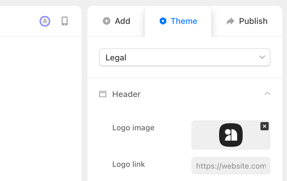
Here's all the things you can configure at Theme level:
Header and logo
In the header section, you can customize the following:
- Logo image: here you can upload your logo in .png or .jpg format (inbox providers don't support formats like .webp).
- Logo link: this is the website your users are directed to after clicking your logo.
- Logo width: drag to set a max width for your logo, the height will be dynamically set to retain the proper scale.
- Logo spacing: drag to increase/decrease the space between your logo and your title/date and body content.
- Alignment: left-align, center, or right align your header.
- Auto-inserted title/date: check these boxes to dynamically insert the title of your draft and the date into your email header. This is useful if you're also publishing your email content to your website or if you want more "newsletter" style emails.
Footer and social icons
In the Footer section you can configure the following:
- Social icon bars: add social icons that link to all of your accounts on various platforms.
- Alignment: left-align, center, or right align your footer content.
- Footer content: in this rich text field, you can set a universal footer that gets appended to each email.
- Show/Hide the Audienceful badge: if you're on a paid plan, you can whitelabel your emails and remove our branding from the footer
Layout presets
In Layout, you're able to configure the following:
- Max width: set a custom max-width for your email canvas (we recommend not exceeding 600px for maximum compatibility).
- Corner radius: set custom pixel rounding values for corners on different blocks
- Margins: set images to break out of margins and appear "full-bleed"
- Buttons: here you can choose to make all buttons default to full-width
Typography and fonts
For typography, we offer the entire selection of Email-safe font stacks to choose from. Created by professional designers to scale up and down with the perfect line-heights and spacing for each H1, H2, H3, H4, P, LI, and blockquote.
These all have to be system fonts, because loading or embedding webfonts is not supported by a majority of inbox clients.
Did you know: 76% of inboxes (including most Gmail and Outlook clients) do not support web fonts, so it's best to stick with system fonts. Yes, it sucks, but we strongly recommend not fighting this. Not only will your email look off in unpredicatable ways for most users, it also raises flags in certain spam algorithms as external fonts are a vector for exploits.
Ecommerce brands often get around this by exporting their email designs as images with text baked in. While bad for accessibility and translation, this is your only option for on-brand fonts.
Color schemes (including dark mode)
For your brand's color scheme and palette, we offer two options.
- Specify only light mode colors: this is recommended if you aren't a designer and aren't sure how this will affect most major email clients. For inbox providers like Gmail and Outlook, they often force dark mode by inverting your colors depending on the platform. So this option is most lightweight.
- Specify light mode AND dark mode colors: use this checkbox to specify a custom dark mode if you want maximum control over colors. Many modern inbox providers will now obey dark mode color schemes if specified. However, you can't set overrides for dark mode.
Using Block-Level Overrides
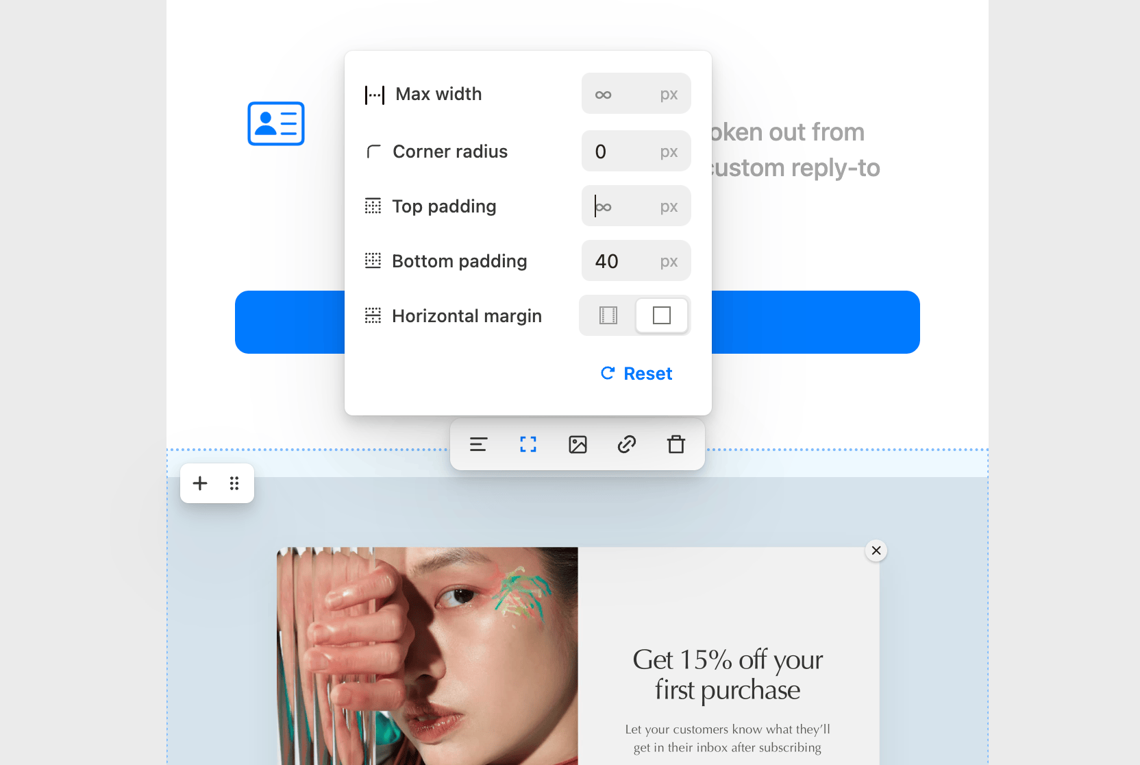
For consistency, it's usually best to solve design problems at Theme-level first. However, in the process of creating emails you'll definitely run across scenarios that require breaking out of your global theme.
This is where individual block overrides come in. Here's all the options:
- Layout: Set custom max-widths, vertical spacing (padding), collapse margins, and customize multi-column and container blocks
- Typography: Override the type styles of your theme with custom fonts, sizes, line heights and more.
- Color: Set custom colors that override your theme.